go back
Client
Bounty
Bounty is a rewards card built for the everyday, turning the purchases people make naturally into moments of reward. From morning coffee and groceries to dinners, shopping, subscriptions, and everything in between, Bounty makes everyday spending feel a little more rewarding.
Goal
Branding a product that is always evolving, something that stands for financial freedom made simple.
MY ROLE
Identity design • Illustration style • Art direction • Branding • Guidelines • Conceptualising • Moodboarding • Collaboration
Explorations
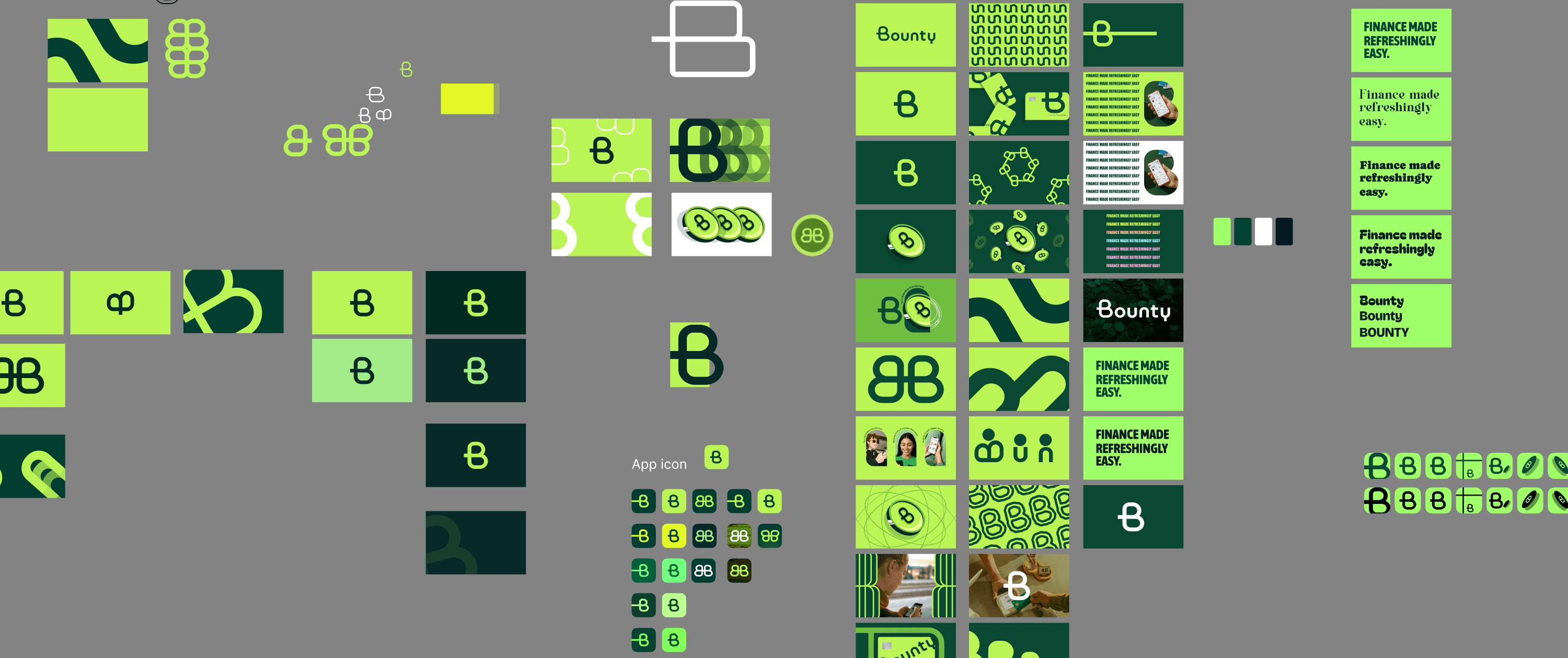
The idea of “bounty” naturally lends itself to the language of finding, collecting, discovering, and being rewarded. This gave the brand permission to be more expressive than a typical financial service.
The visual identity explorations used typography paired with lively graphic elements, unexpected moments, playful copy, and a sense of movement.
Rewards can feel like little discoveries, something you notice, collect, and enjoy. The key was controlled playfulness. Nothing should feel random or juvenile. The underlying design system should be clean and considered, with playful elements layered onto a strong, trustworthy foundation.













Logo
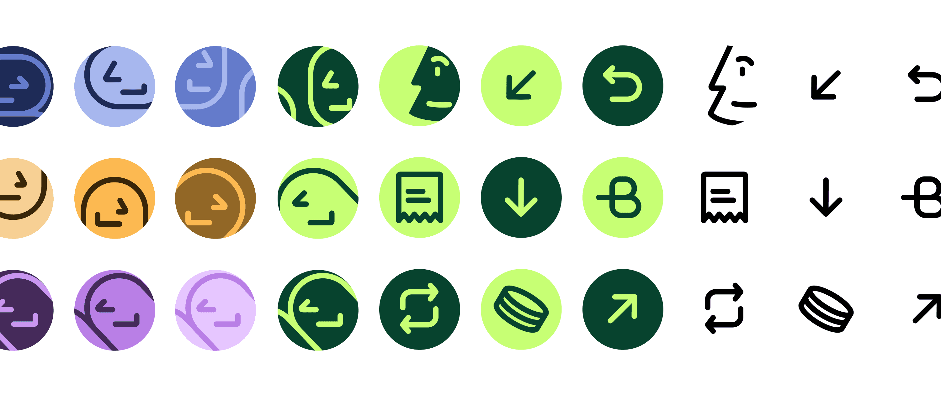
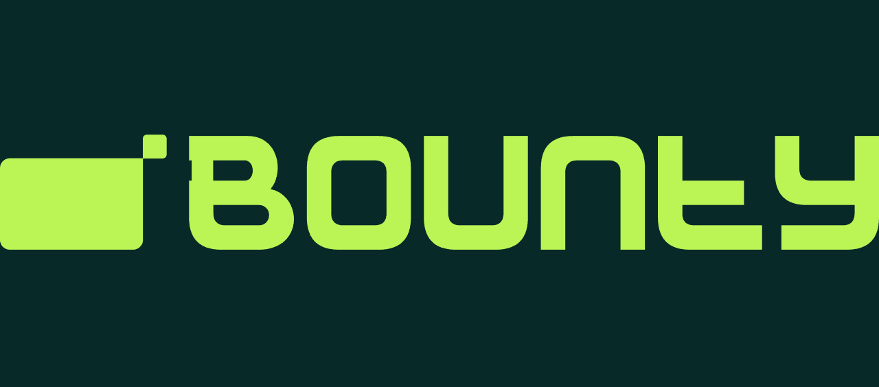
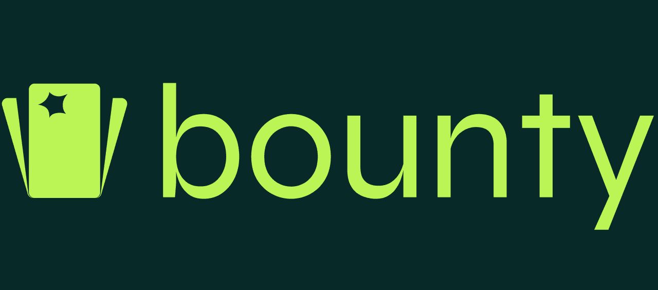
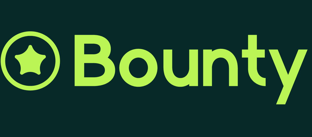
Ultimately, Bounty should make the idea of earning rewards feel less like a financial mechanism and more like a natural part of everyday life. To represent that infinite flow, the loop of B becomes the logo mark, with a small card-like reset switch to represent daily resets.

Color Palette
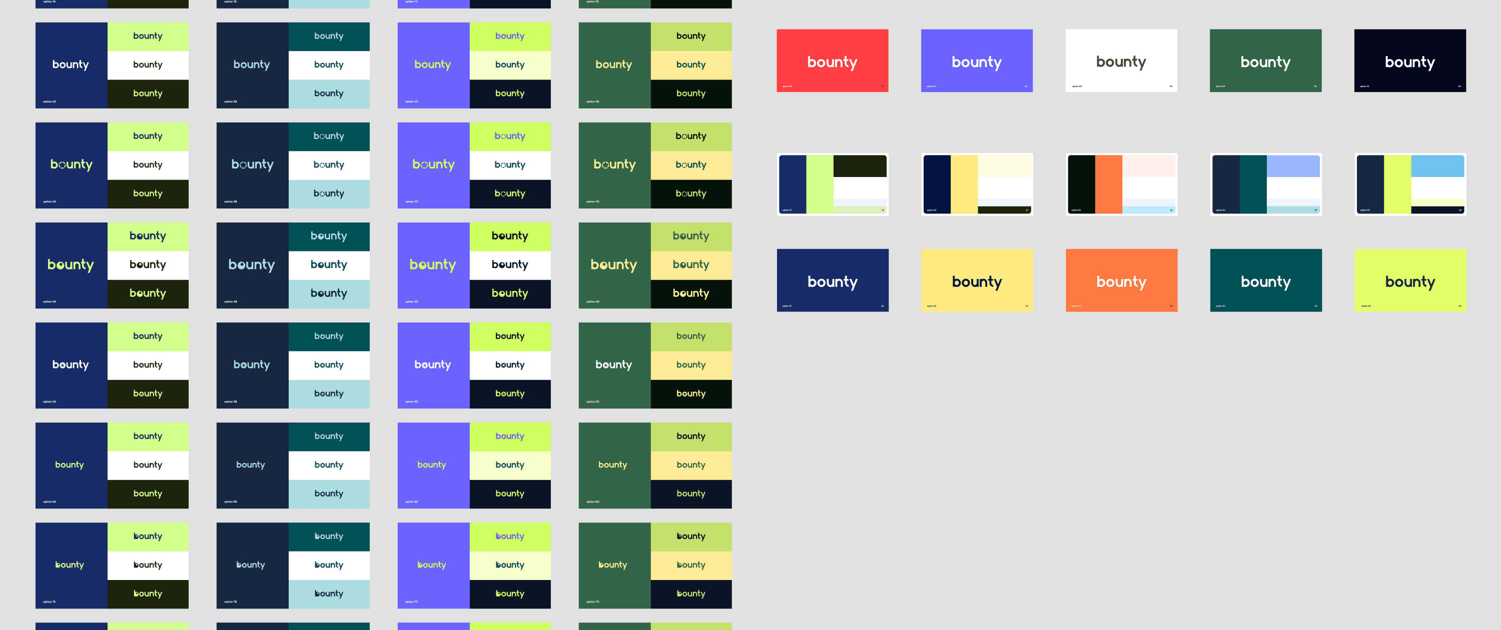
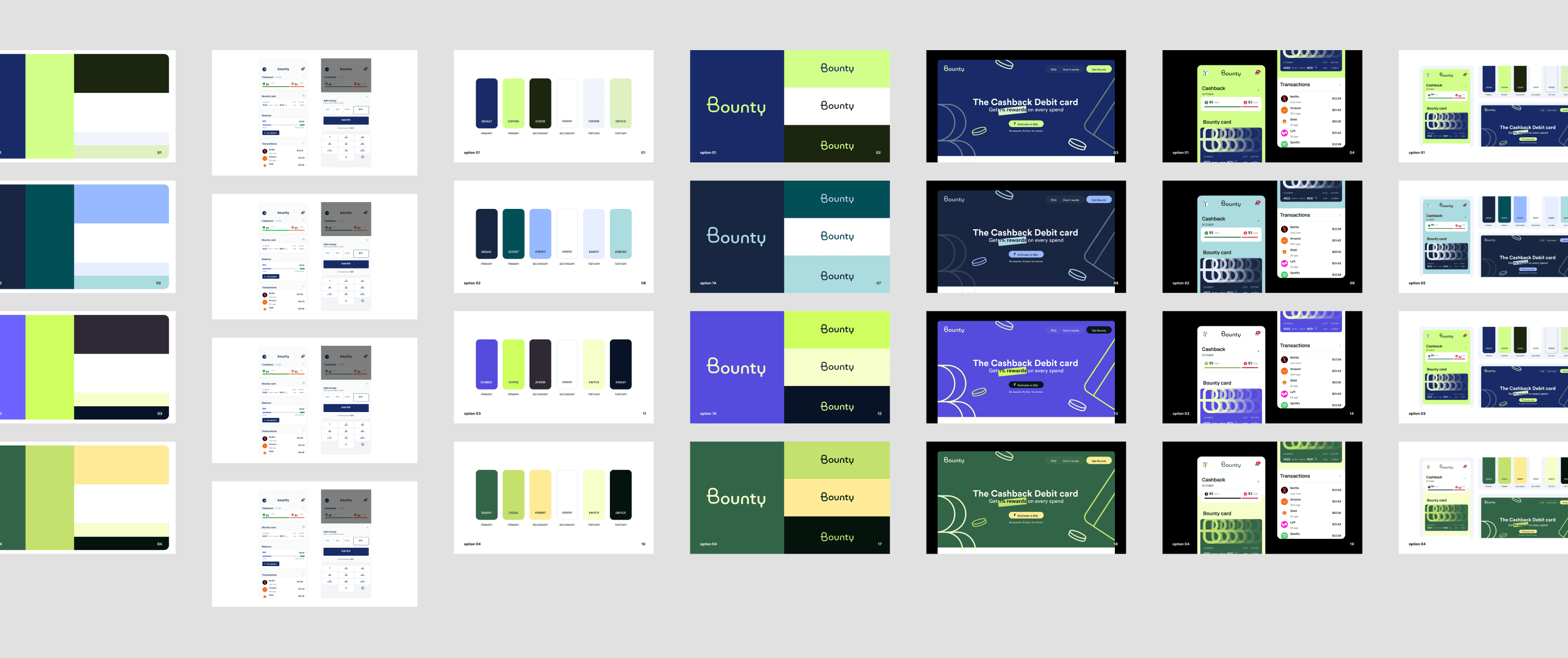
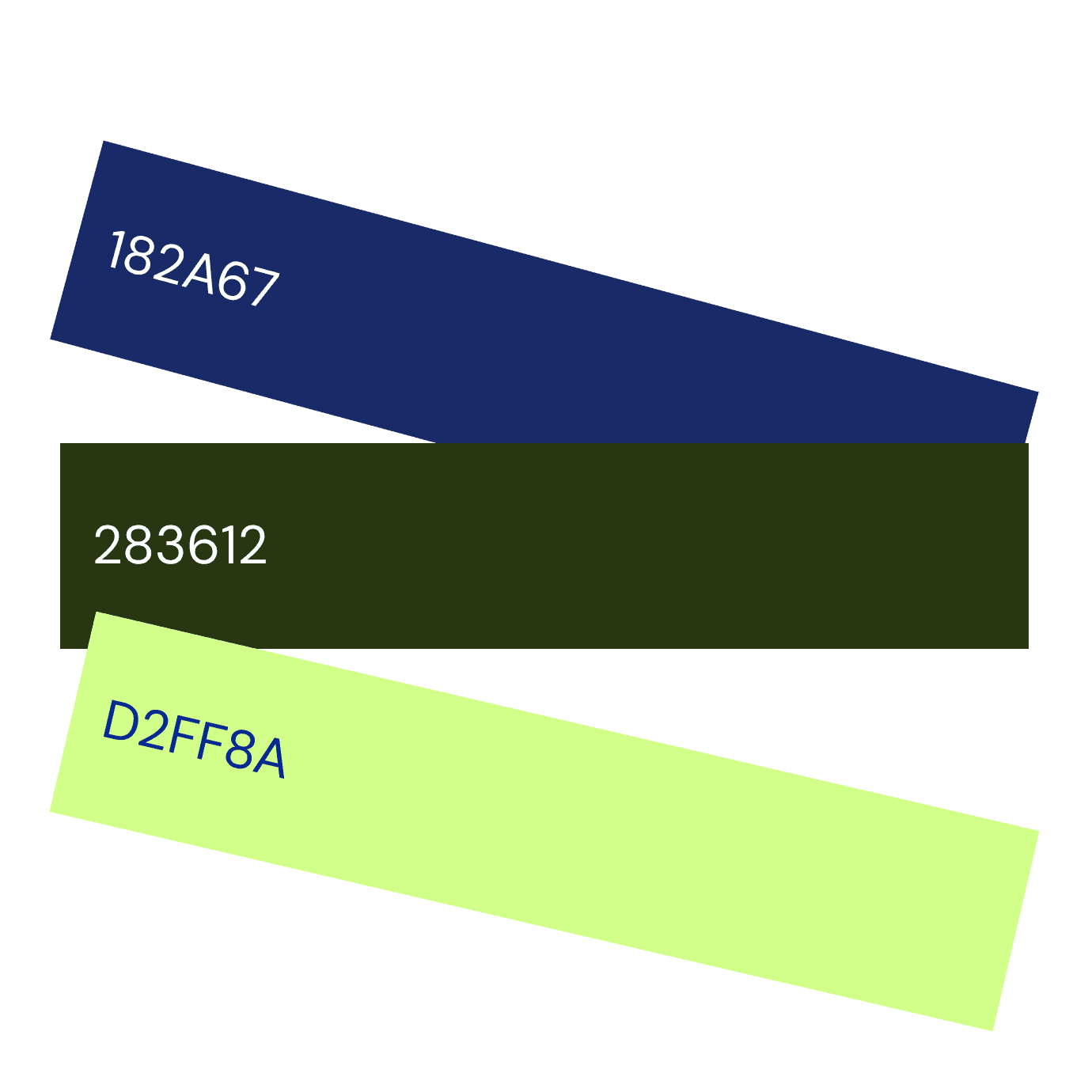
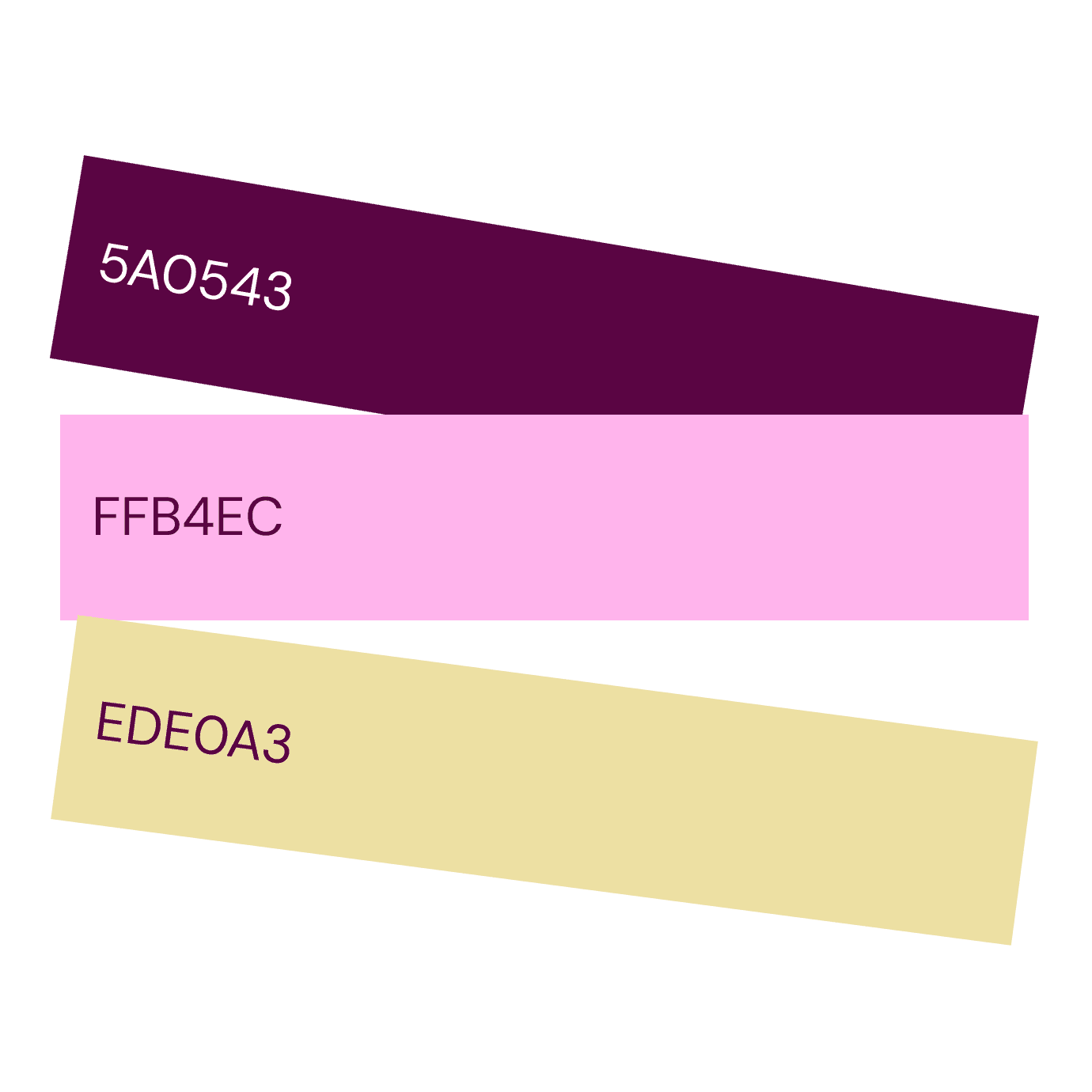
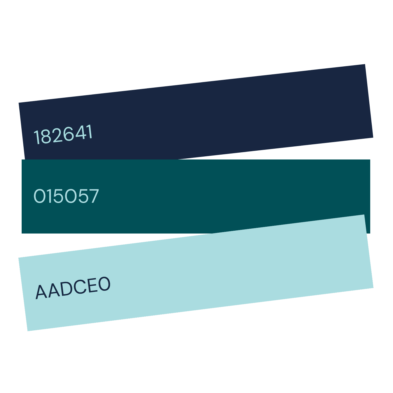
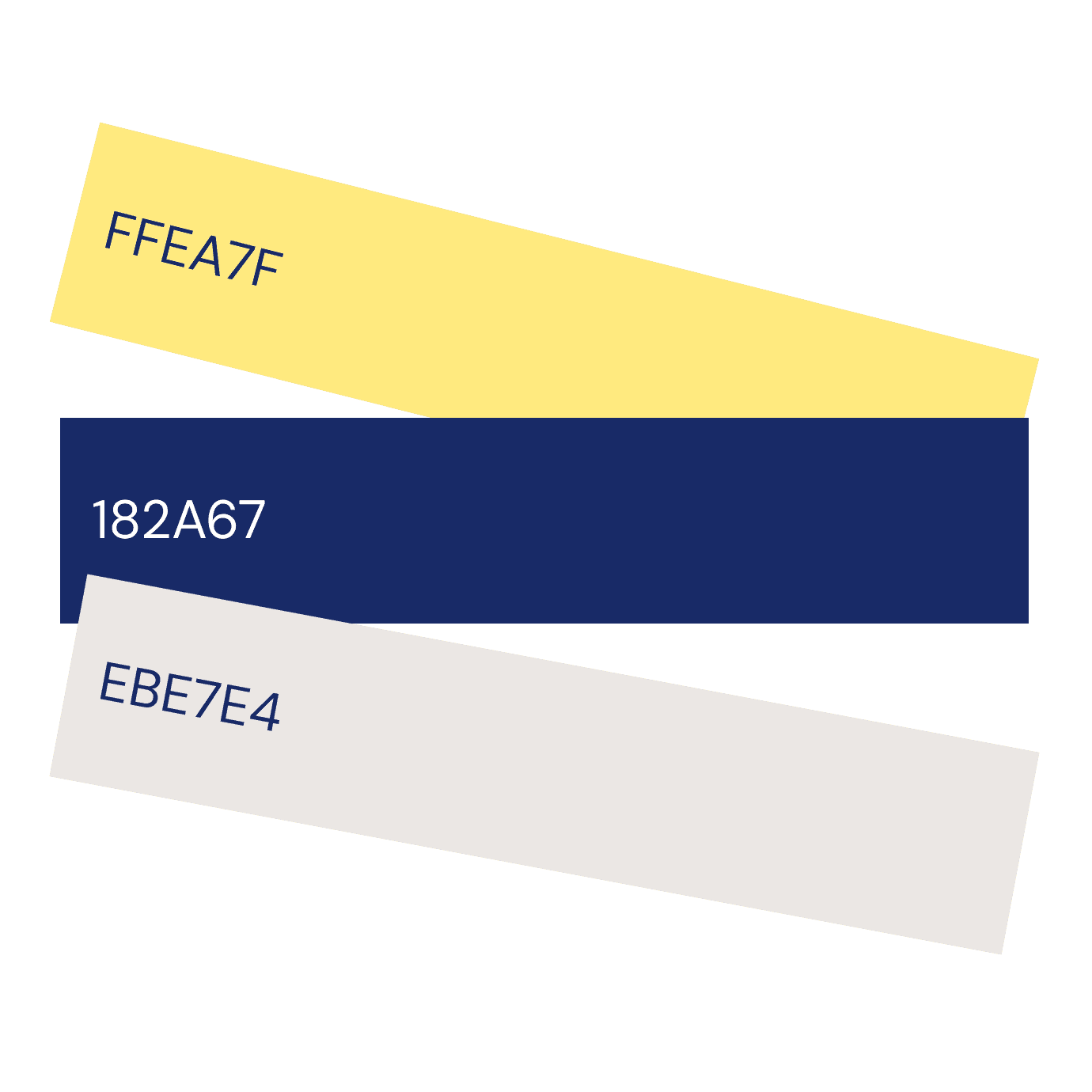
The forest green becomes a recognisable anchor of the brand. As green connects naturally to growth and reward. Adding to the palette to extend it in an optimistic, energetic, and playful direction, shades of bright pastels are added as a secondary palette.
Typography
Bounty uses Google Sans, a clean, modern sans-serif typeface for legibility and precision. A friendly rather than overly corporate character.
For all marketing and print materials, the use of Lexend makes more sense because its rounded forms reflect Bounty’s friendly personality, while its modern geometry keeps the brand confident.
Aa
Sans
Google Sans Extrabold
Google Sans Bold
Google Sans Semibold
Google Sans Medium
Google Sans Regular
Google Sans Light
Google Sans ExtraLight
Aa
Lexend
Lexend Extrabold
Lexend Bold
Lexend Semibold
Lexend Medium
Lexend Regular
Lexend Light
Lexend ExtraLight
Illustration style
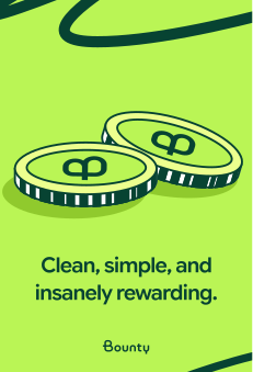
The style that feels graphic, simple, slightly unexpected, and instantly recognisable.


Iconography
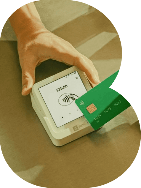
Brand Application - cards, ads, usage