go back
Client
An Indian online learning platform offering live and recorded educational content, primarily for competitive exam preparation and professional development.
Goal
To redesign the creative language and illustration style for all of Unacademy's apps and scale them across all media.
MY ROLE
Product Illustration • Iconography • Illustration systems • Branding • Guidelines • Print Design • Conceptualising • Moodboarding • Visual Design • Collaboration • Team Management
year
2021-2024
Team
Sole contributor alongside the product design team, 2021-2022
Team lead & contributor, 2023-2024
Explorations
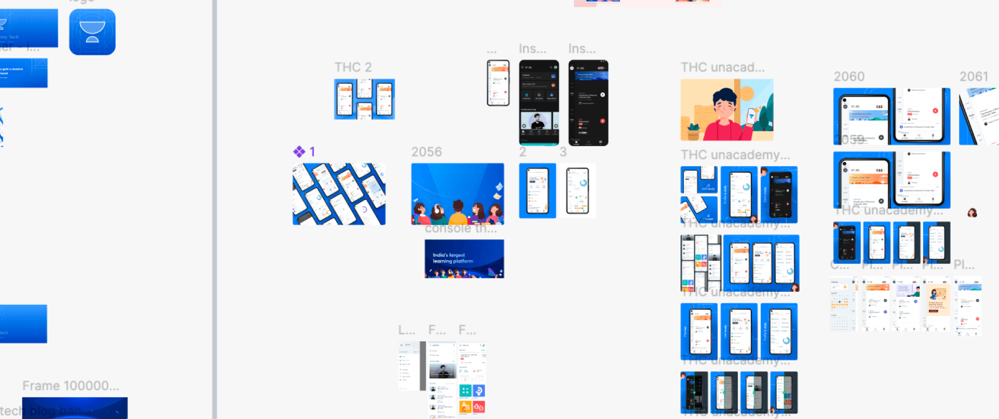
Started with understanding the brand’s perspective through the minds of the learners, the primary users of Unacademy’s learner app. Following that moodboarded and explored an illustration style that felt friendly, welcoming, and warm, while still being subtle enough to work within a learning environment.
Since the main purpose of the app was learning, I wanted to make sure the illustrations never became a distraction from the content. I treated them more as a supporting layer, something that could help communicate an idea, guide the user, or add a small moment of delight without taking away from the learning experience.


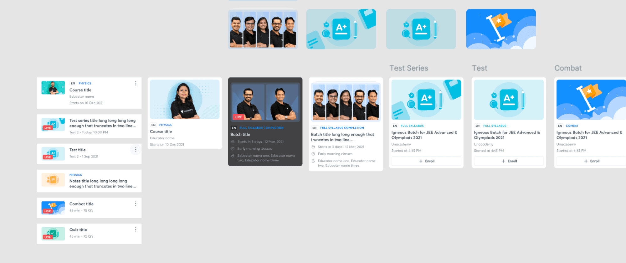
Feature colors & identity
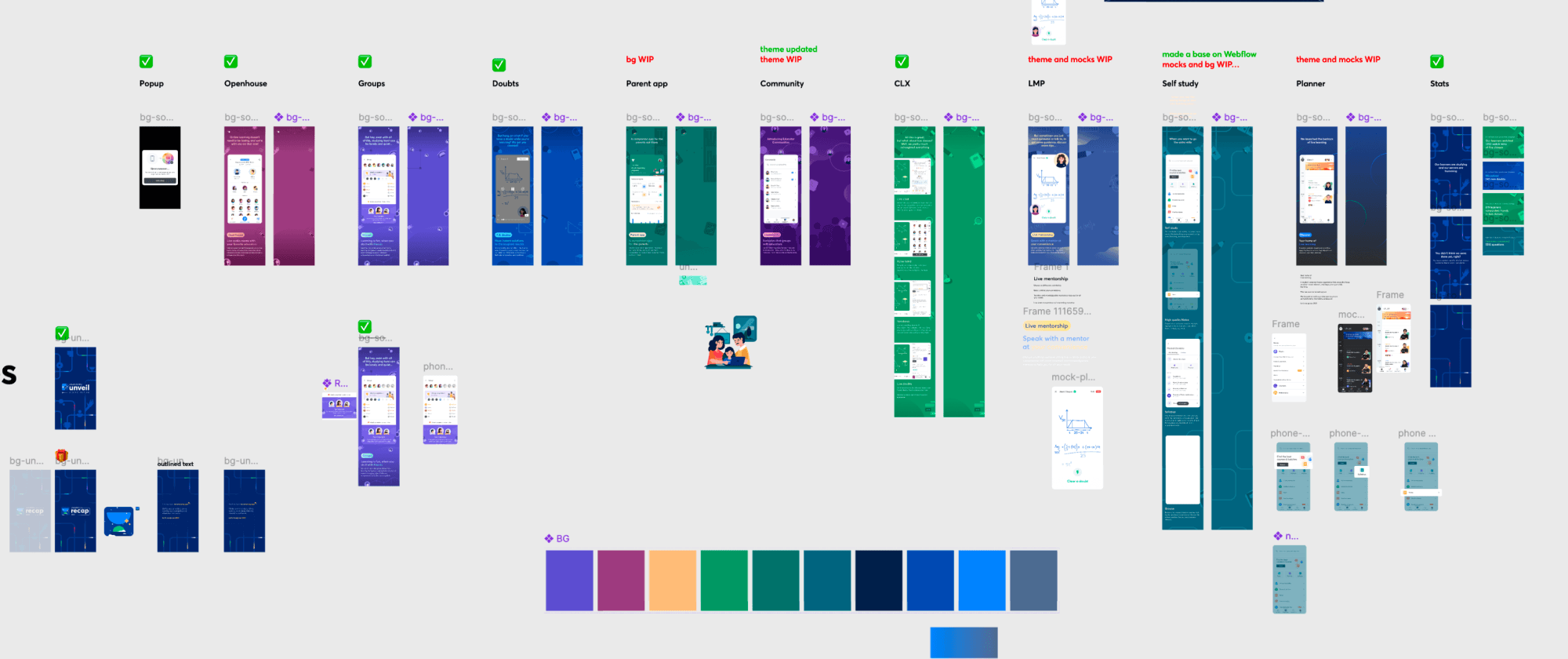
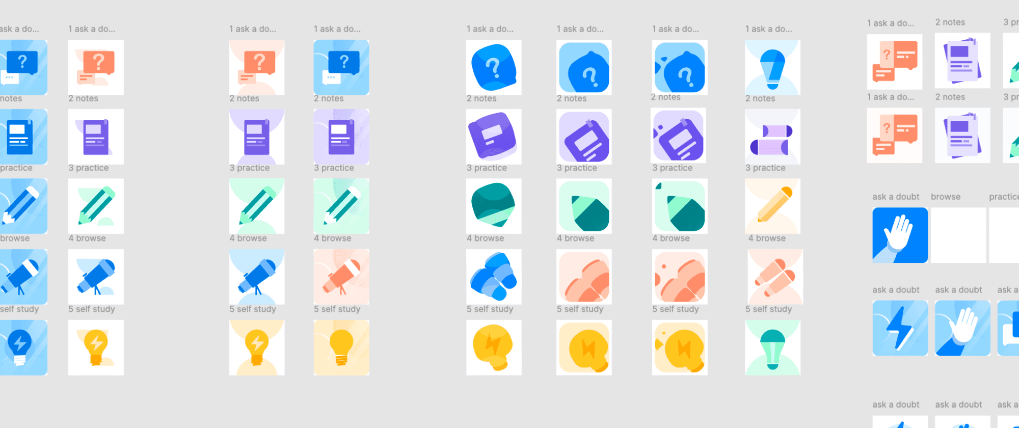
Also explored how colour could work beyond just complementing Unacademy's existing blue and green brand colours. Introduced a broader palette that worked harmoniously with the primary brand colours, while giving different areas of the app their own visual identity.
I identified the different features and learning areas within the product and assigned each of them a distinct colour.
This helped create a simple visual association, allowing users to recognise and differentiate areas more easily without having to rely only on labels or navigation.
The colours were carried consistently across illustrations, icons, cards, backgrounds, and other touchpoints within each area. This helped create a sense of identity while still keeping everything connected to the larger Unacademy brand.


Introducing friendly characters
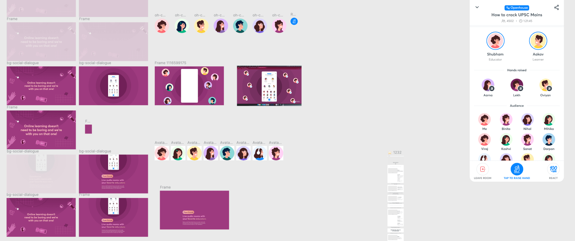
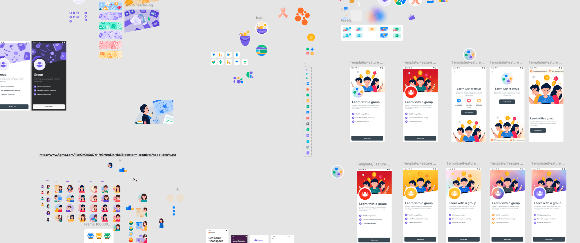
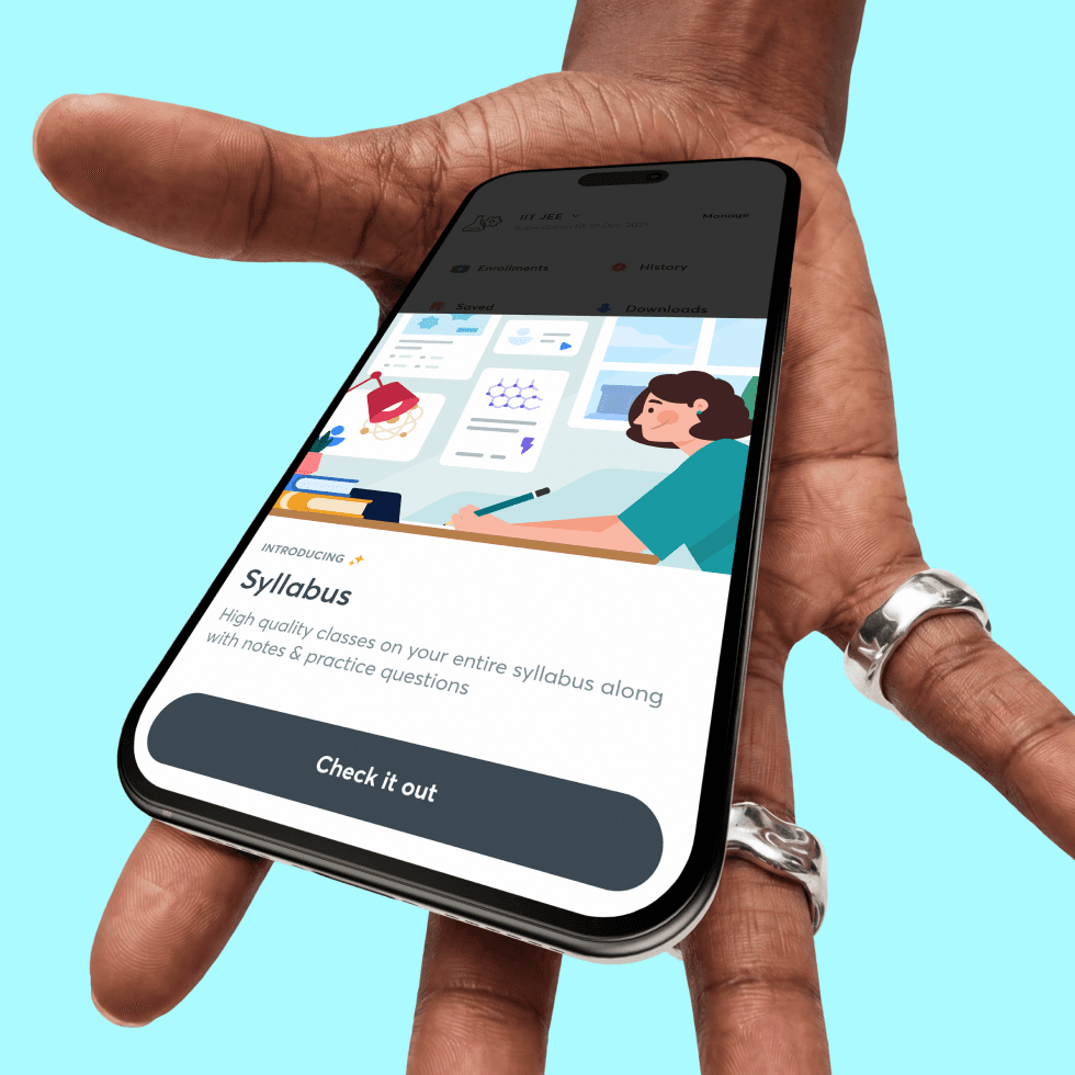
I kept the illustration style simple and approachable, using soft forms, friendly characters, and minimal details.
I wanted it to feel human and expressive, but not overly playful or childish. There was a certain restraint to the visual language so that it could sit naturally within the Unacademy ecosystem.


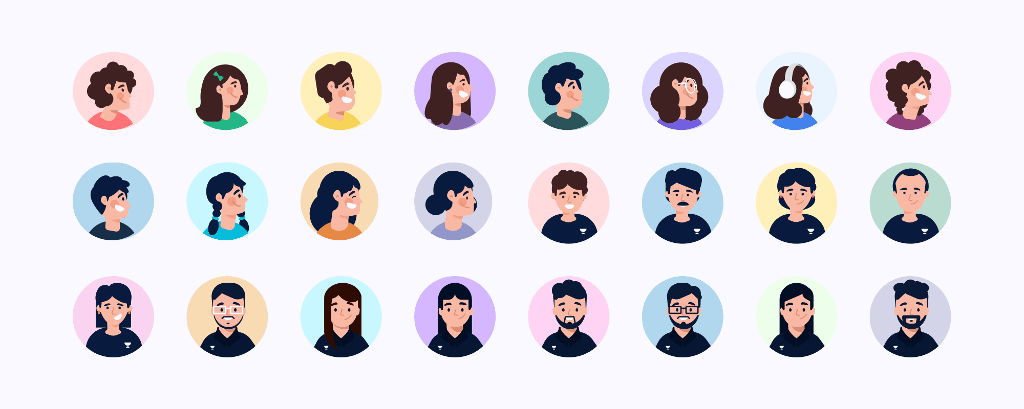


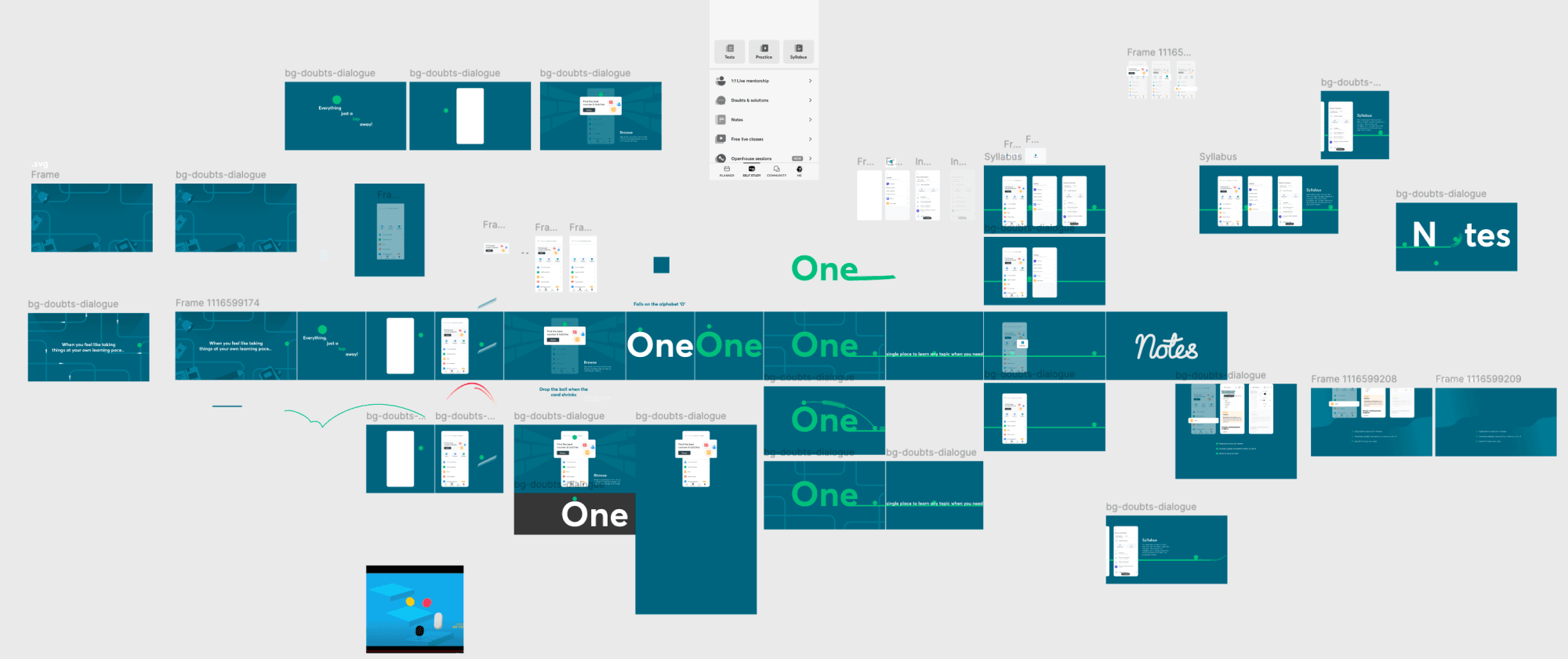
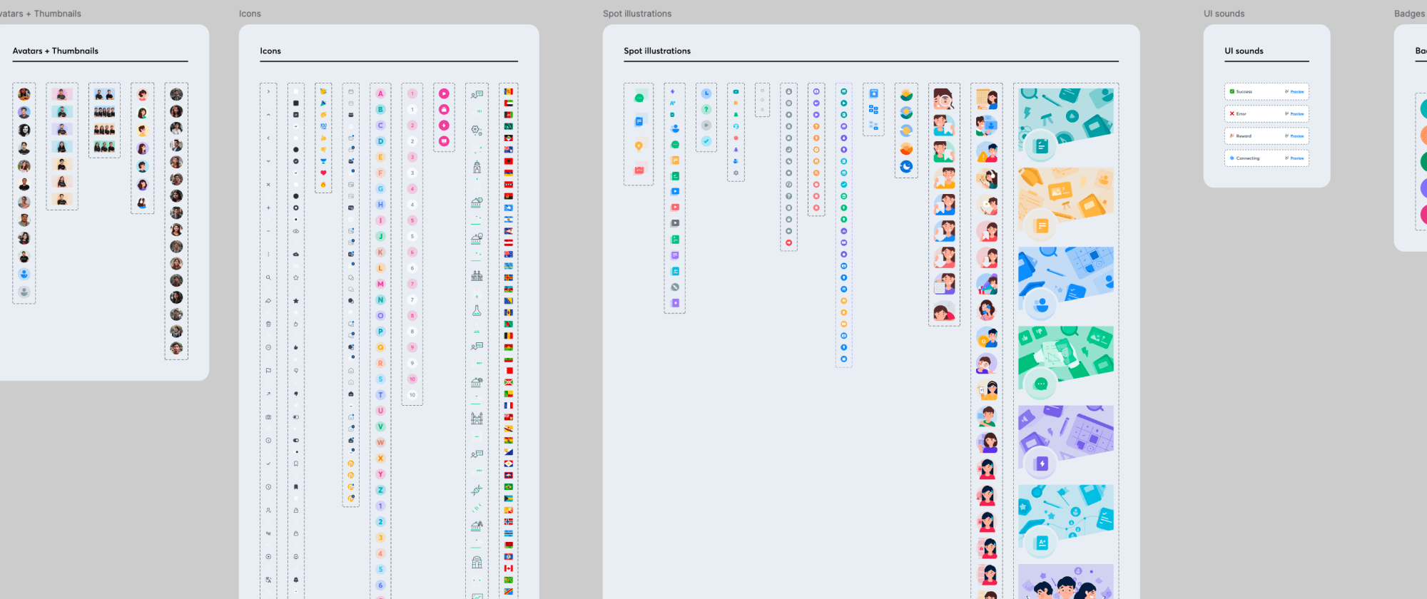
Spot Illustration, icons and thumbnails





Unacademy Unwrap
A story-format experience that presented interesting stats and moments from a teacher’s journey throughout all of last one year. Instead of presenting the information as a conventional dashboard, we used a more narrative format that allowed the teacher to move through their story and discover different milestones, numbers, and highlights. I also wanted to connect this experience back to the learner, making it feel less like a one-way celebration and more like a shared moment between teachers and learners.
To do this, I connected the Teachers’ Day experience with the hat dedication flow that already existed within the app. A learner could choose a teacher and dedicate a special Teachers’ Day hat to them, creating a direct connection between the learner and the teacher within the experience.
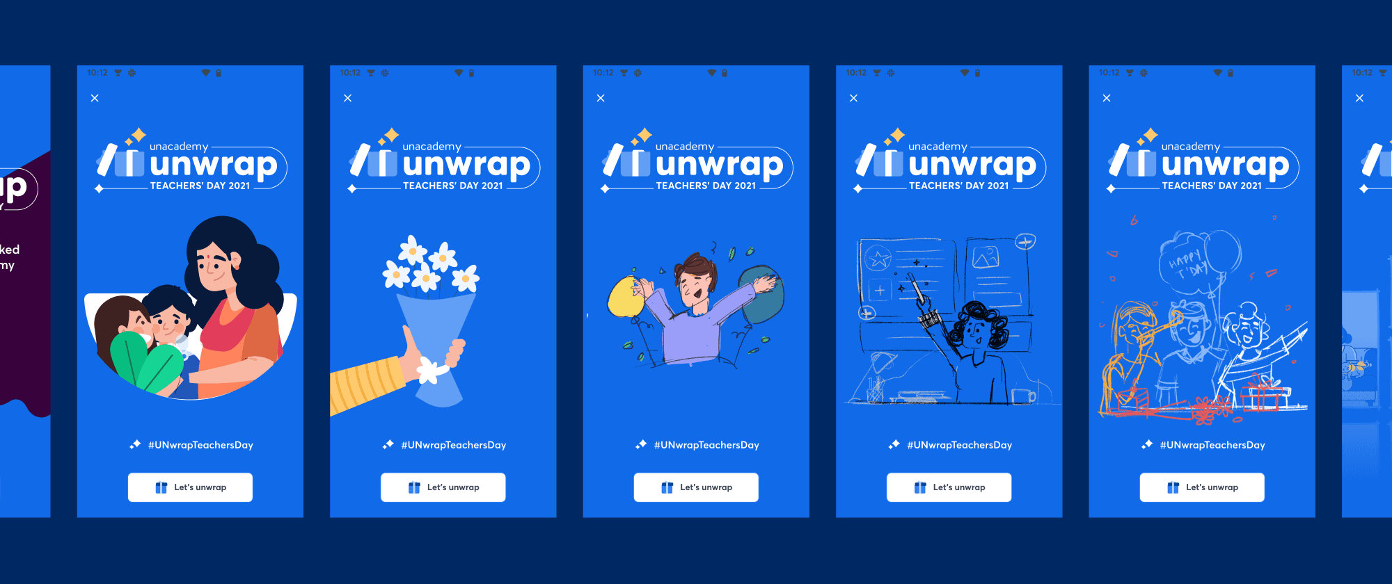

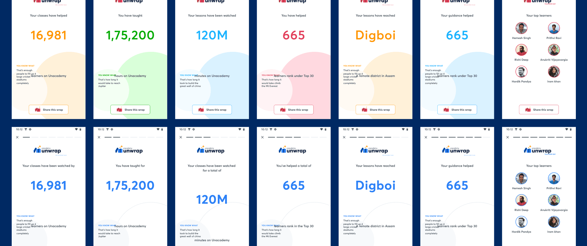
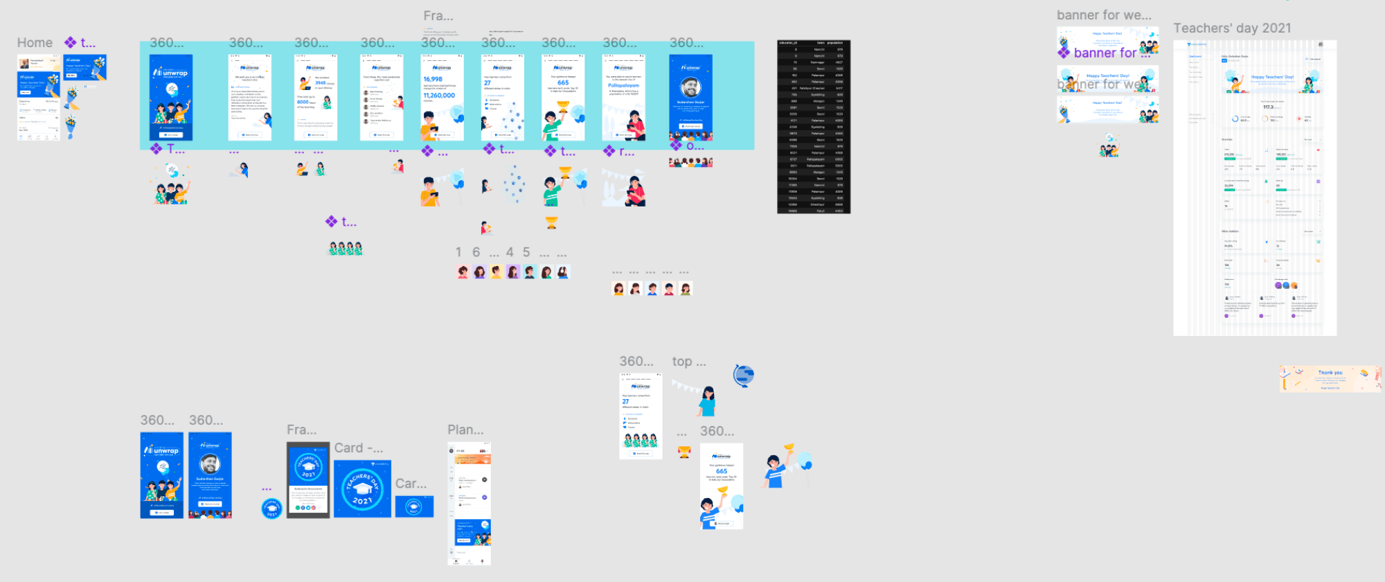


Unacademy Recap
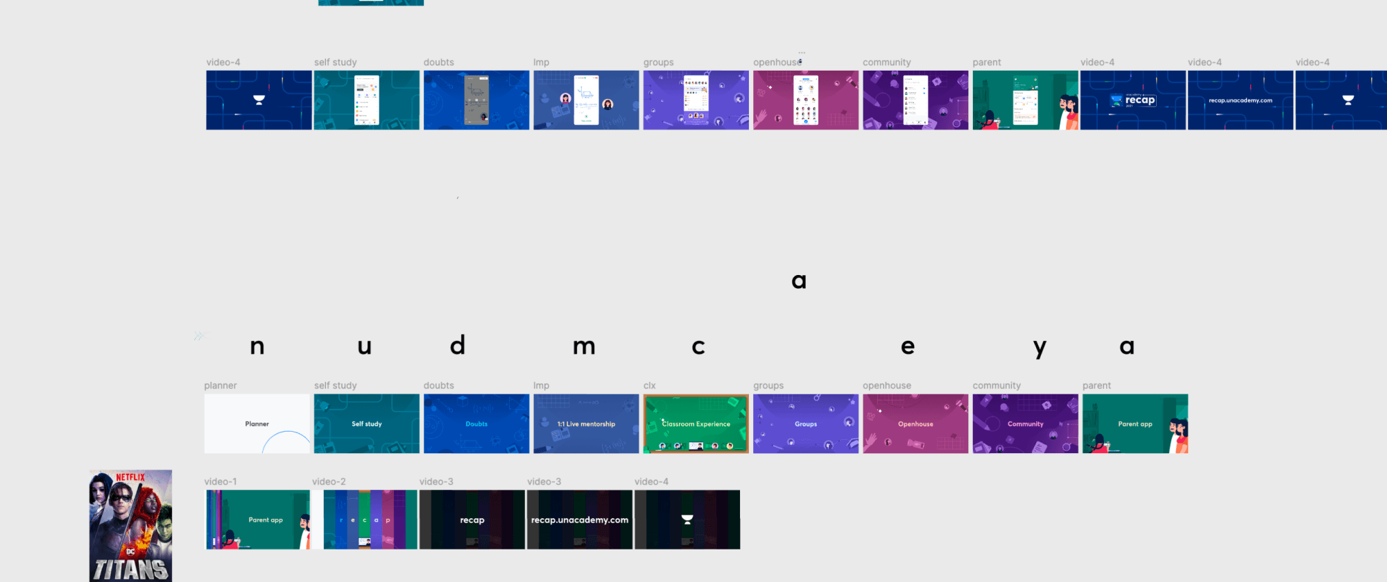
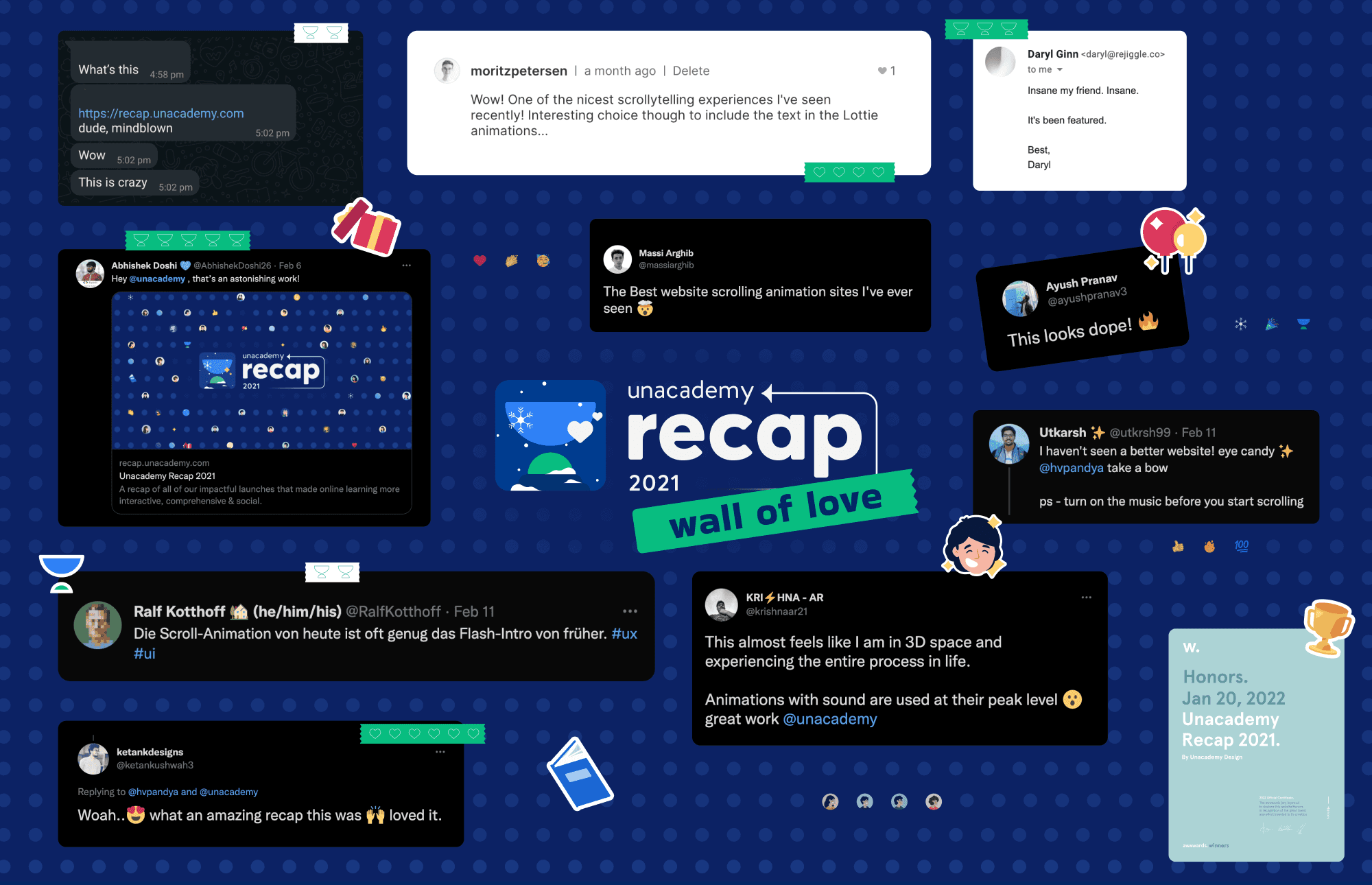
What made the project special was how closely all of us worked together. Illustration, animation, design, and development weren't treated as separate pieces — they came together as one continuous storytelling experience.
We were essentially trying to capture an entire year of design work in one journey and make people experience the recap rather than just read it.
The project was a true collaboration between the four of us - Rishi, Prithvi, Kailash, and me. To make the recap feel like a little bit of magic.